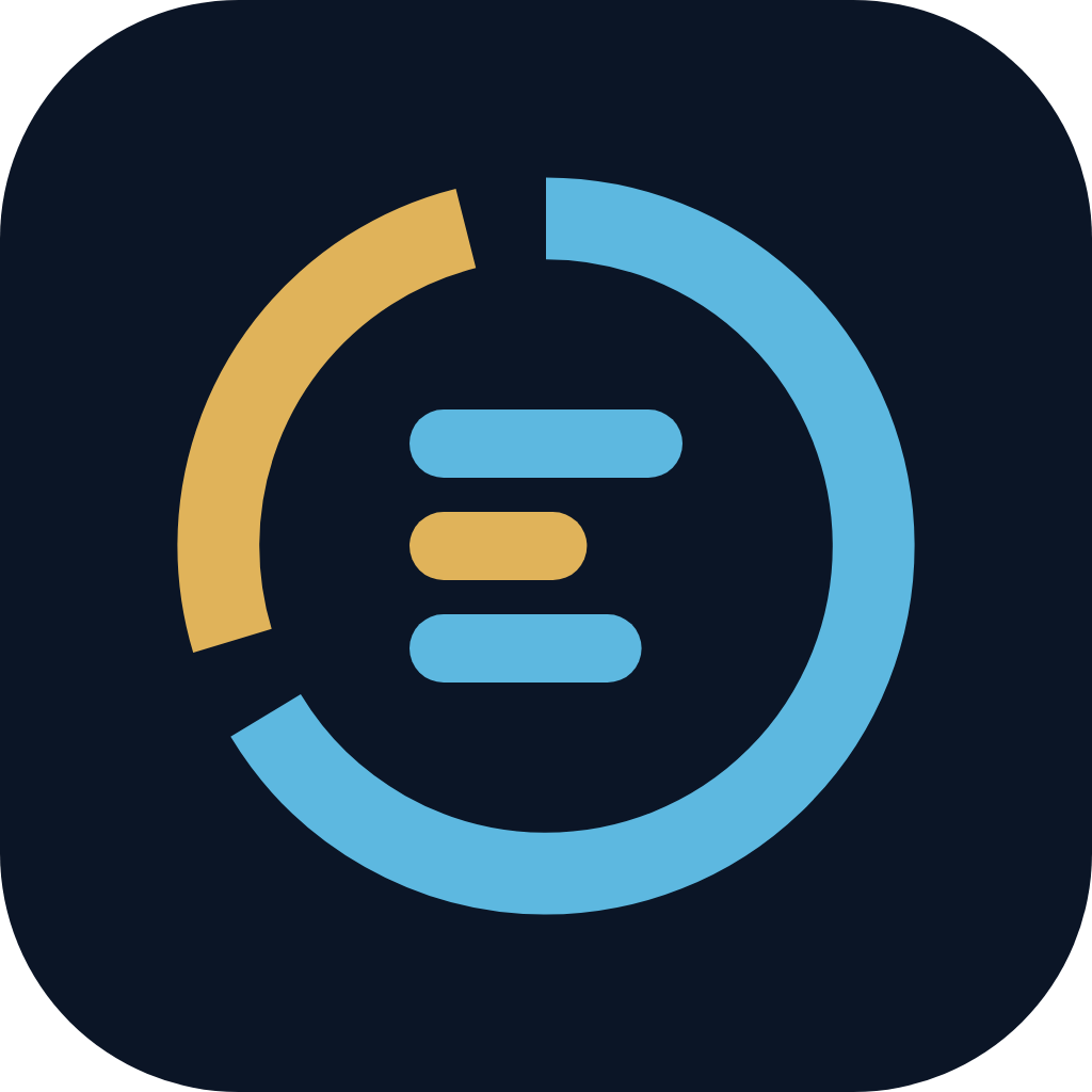
The Posture ring
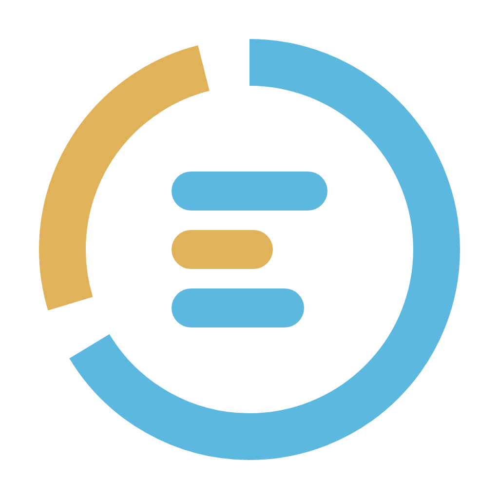
A donut chart wrapped around an E. It reads as a security posture score: most of the ring is proven (Aegean sea blue), and a bronze arc marks what is still being questioned. Inside, three bars form the E of Elenchos and echo a short evidence list.
- Ring: radius 24, stroke 6, starting at 12 o’clock. Sea-blue arc is two thirds of the circle (100 of 150.8 units).
- Bronze arc: 38.8 units, separated from the blue by two 6-unit gaps. It stands for the claims still being tested. It never moves.
- The E: three rounded bars, 20, 13 and 17 units wide, left-aligned at x 22. The short bronze middle bar ties the E to the arc.
- Never redraw. Always place the master SVG. The geometry is defined in
build.py.
Primary lockup
The wordmark is “Elenchos” set in Source Serif 4 Semibold, letter-spacing −0.5, placed to the right of the mark at a gap of a quarter of the mark’s width. The legal name, Elenchos Technology Services Pvt. Ltd., is used in footers, contracts and invoices, never inside the logo.
 Primary · on dark
 Primary · on light
[Product] by Elenchos
Every product uses the same master mark, never a product-specific variant. The product name takes the wordmark’s place; “by Elenchos” sits beneath it in Public Sans, uppercase, tracked 0.14em, at roughly a third of the name’s size. Elenchos Core is written in full and drops the “by”.
Aegean & Bronze
Deep navy carries the brand; sea blue is for what is proven and interactive, bronze for emphasis and what is still in question. On light grounds use the deep variants, which pass WCAG AA against white.
Give it room
Keep clear space of x on every side, where x is the width of the E’s top bar (20 of 64 units, about a third of the mark). Nothing, including other logos, text or the edge of the page, goes inside that space.
Minimum sizes
(favicon tile only)
screen minimum
(print 30 mm)
Below 24 px the bronze gaps close up, so use the app icon tile instead of the bare mark. Below 110 px wide, use the mark alone.
Light, dark and one colour
Use full colour wherever you can. The one-colour version keeps the gaps so the ring still reads as a chart; use it for embossing, single-colour print, watermarks and partner pages that require monochrome logos.
The tile
For browser tabs, home screens and app stores, the mark sits at 80% on a navy rounded square (corner radius 14 of 64). Use the PNG sizes below as supplied; do not crop the tile into a circle.


 Elenchos — Question…
Keep the ring honest
The mark is a chart, so changing its proportions changes what it says. These are the mistakes we see most.
use the dark version on navy and dark imagery.
use the deep light version on white and parchment.
use one colour when only one ink is available.
keep clear space of x around the lockup.
stretch or squash the mark.
rotate it. The arc always starts at 12 o’clock.
recolour it outside the palette.
add shadows, glows, bevels or gradients.
change the arc split or the bar lengths.
place the light version on mid-tone colour.
place it on busy patterns or photos.
retype the wordmark in another face or style.
Two faces, both open source
Source Serif 4 gives headlines the voice of an argument well made. Public Sans keeps interface and body text plain and legible. Both are SIL Open Font Licence and self-hosted in the app and on the website.
App, video and website
The same mark and palette run through every surface, so a customer moving from the website to a demo film to the product never wonders whether they are in the right place.
Question everything.
Prove it.
Master files
Always start from these. SVG for screens and print, PNG where SVG is not accepted. The lockup SVGs use live text; outline the type in a design tool before sending to print.